

How to Spot High Quality Prints: A Buyer's Guide
Table of Contents
- What Makes a Print High Quality
- Screen Printing vs Digital Printing Quality
- Inspect Color Accuracy and Vibrancy
- Check for Pixelation, Sharpness, and Resolution
- Evaluate Paper Quality, Weight, and Finish
- Signs of Poor Quality Graphic Tees to Avoid
- How to Wash Graphic Tees Properly for Longevity
- Tactile Inspection: What Quality Feels Like
Last Updated: August 20, 2026
What Makes a Print High Quality
High-quality prints are defined by visual sharpness, color accuracy, durability, and tactile integrity. The difference between a print that lasts five wears and one that lasts fifty comes down to specific technical choices made during production.
At Hot Takes Designs, we focus on vibrant, long-lasting prints that don't crack, fade, or peel. The foundation of any quality print rests on three pillars: the printing method used, the inks applied, and the substrate they're printed on. Screen printing and digital printing produce vastly different results, each with distinct advantages depending on design complexity and color requirements. Ink type, whether pigment-based or dye-based, affects both color vibrancy and durability through washing and UV exposure. Paper weight, finish type, and acid-free composition determine whether your print yellows after a month or stays vibrant for years.
This guide walks you through exactly how to spot high-quality prints the moment they arrive at your door.
Screen Printing vs Digital Printing Quality
Screen printing forces ink through a mesh screen onto fabric, creating a thick, raised layer of pigment. This method excels at producing bold, solid colors with excellent vibrancy and archival-grade durability. The prints feel slightly raised to the touch, and colors remain vivid for years because screen-printed inks are typically pigment-based, which resist fading better than alternatives.
Digital printing applies ink directly to fabric using inkjet technology, similar to printing on paper. This method handles complex, multi-color designs with photographic detail far better than screen printing. The ink sits flatter against the fabric, creating a softer hand feel and capturing fine details, gradients, and intricate artwork that would be impractical to screen print.
The trade-off is durability. Digital prints rely heavily on ink quality and fabric pre-treatment. Premium digital printing using pigment-based inks can rival screen printing longevity, but budget digital printing often fades faster under UV exposure or repeated washing.
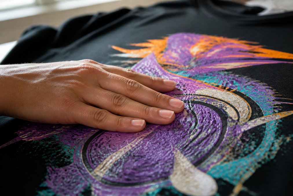
When you receive a print, run your finger across it. Screen-printed designs feel textured and raised. Digital prints feel smooth and integrated into the fabric. Neither is inherently "better", a bold, single-color design suits screen printing, while a detailed, photographic design demands digital printing.
Inspect Color Accuracy and Vibrancy
Hold the print under natural daylight and examine color saturation. Vibrant prints show no fading, no dull patches, and no color inconsistency across the design. If some areas look washed out compared to others, that's a sign of uneven ink application or low-quality ink already degrading.
Pigment-based inks maintain hue consistency because pigment particles remain stable over time. Dye-based inks can shift slightly in tone as they age, which is why archival-grade prints favor pigment formulations. Quality prints designed for longevity use fade-resistant pigments that maintain vibrancy through months of wear and washing.
Inconsistent color is often the first sign that a print won't last. If the color looks slightly off compared to the preview, or if some sections appear darker or lighter than others, the ink application was rushed or used substandard formulations.
Check for Pixelation, Sharpness, and Resolution
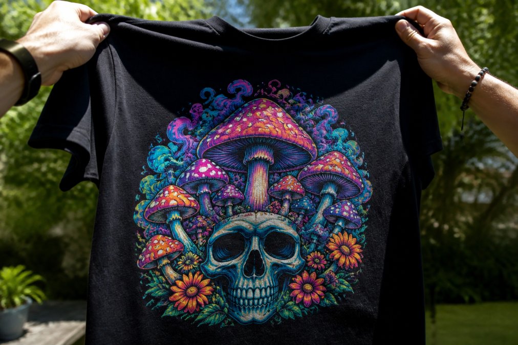
Pixelation and blurriness are telltale signs that a print was created from a low-resolution source file or printed at insufficient DPI (dots per inch). High-quality prints maintain sharp edges and smooth gradients. When you examine the design closely, lines should be crisp and defined, not jagged or fuzzy.
Run your eye along the edges of the design. Crisp, clean edges indicate proper resolution and careful printing setup. Blurry or feathered edges suggest the image was scaled up beyond its native resolution or the equipment wasn't properly calibrated.
Examine any text or fine lines in the design. Sharp, readable text with no jagged edges means the file was prepared correctly. Fuzzy or broken text is a red flag. Chromatic aberration, where colors appear slightly separated or misaligned, indicates printing equipment misalignment or low-quality color registration.
Quality prints show good tonal range, with deep blacks and bright highlights without losing detail in shadows. If the print looks flat or washed out, the tonal range is compressed, which often happens with lower-quality inks or improper color profile settings.
Evaluate Paper Quality, Weight, and Finish
For prints on paper, the substrate determines longevity and visual quality. Paper weight, measured in GSM (grams per square meter), directly correlates to durability and feel.
Lightweight paper (under 150 GSM) feels flimsy and creases easily, prone to yellowing because thin papers often contain optical brighteners that degrade over time. Mid-weight paper (150-250 GSM) is standard for quality prints, it feels substantial, resists creasing, and holds color well. Heavy-weight fine art paper (250+ GSM) is archival-grade and designed for longevity.
Acid-free paper is essential for archival prints. Acid causes yellowing and brittleness over time, which is why museum-quality prints use acid-free substrates. If the product description doesn't mention acid-free paper, assume it will degrade within a few years.
The finish type affects both aesthetics and durability. Matte finishes are non-reflective and hide fingerprints well. Luster finishes have a subtle sheen that enhances color without glare. Glossy finishes are bright and vibrant but show fingerprints and reflections easily, amplifying any printing defects.
Run your fingers across the print surface. Quality paper has smooth, consistent texture. Cheap paper feels rough or has visible texture variation. The weight should feel substantial, not flimsy.
Signs of Poor Quality Graphic Tees to Avoid
Cracking and peeling are the most common failures. If the print cracks when you fold the fabric or pieces of ink peel away, the ink adhesion was poor. This happens when fabric wasn't properly prepared before printing or when low-quality inks were used. Cracks typically appear first along design edges, where the ink-to-fabric bond is weakest.
Fading is another major red flag. If the print looks noticeably lighter than the preview image or some colors have faded while others remain vibrant, the inks lack UV resistance. Dye-based inks fade faster than pigment-based inks, especially in designs with bright colors or fine details.
Stiffness indicates too much ink was applied or the wrong ink type was used. Quality prints feel soft and move naturally with the fabric. Stiff prints feel plastic-like and uncomfortable, and they're more prone to cracking because the rigid ink layer doesn't flex with the fabric.
Color bleeding occurs when inks aren't properly fixed to the fabric, allowing them to migrate into surrounding areas. You'll notice soft, fuzzy edges where colors blur into each other, or colors transferring onto your skin when you wear the tee.
Poor color consistency means some areas of the design are darker or lighter than others, indicating the printing equipment wasn't properly calibrated or ink coverage was uneven. Uneven printing coverage shows as gaps, thin spots, or areas where the design appears incomplete.
How to Wash Graphic Tees Properly for Longevity
Wash inside-out to protect the printed side from direct friction and detergent exposure. Use cold water, hot water accelerates fading and can damage the ink-to-fabric bond. Choose a gentle or delicate cycle to reduce mechanical stress while still cleaning effectively.
Avoid bleach and optical brighteners in detergent. Bleach chemically attacks inks, causing fading and color shifts. Use a gentle, dye-free detergent instead. Wash with similar colors to reduce the risk of color bleeding or transfer.
Air dry whenever possible. Dryers generate heat and mechanical tumbling that damages prints. If you must use a dryer, use the lowest heat setting. Never iron directly over the printed design, if you need to remove wrinkles, iron the back of the tee or use a low heat setting with a cloth barrier.
Store in a cool, dry place away from direct sunlight. UV exposure fades prints over time, even when the tee isn't being worn. Don't over-wash, every wash cycle contributes to gradual wear. If a tee doesn't have visible stains or odor, skip the wash and air it out instead.
Tactile Inspection: What Quality Feels Like
Feel the weight and drape of the fabric. Quality apparel uses substantial fabrics that feel soft and luxurious, not thin or scratchy. The fabric should drape naturally and feel comfortable against your skin.
Run your fingers across the printed design. High-quality screen prints feel slightly raised and textured. Digital prints feel smooth and integrated into the fabric, with no raised edges or rough spots. Check for adhesion by gently rubbing the edge of the design with your thumb. A quality print won't shed ink or peel.
Examine the seams and construction. Quality apparel has reinforced seams, finished edges, and even stitching. The collar should be reinforced and feel sturdy. Check the tag, quality brands use substantial, well-sewn tags. Weight the entire tee in your hands. Quality apparel feels substantial and well-made.
When evaluating high-quality prints, remember that quality manifests across multiple dimensions: visual sharpness, color consistency, ink durability, fabric quality, and construction integrity. No single factor determines quality, it's the combination of thoughtful choices made throughout the design and production process.
Hot Takes Designs prioritizes these elements because we understand that your apparel represents your identity. Every tee is custom-printed on ultra-soft fabrics with vibrant, long-lasting prints designed to survive washing, wearing, and fandom celebrations. When you receive a print from Hot Takes Designs, you're getting apparel built to last, not something that cracks after two wears or fades after three months. That's what quality actually means.
Frequently Asked Questions
How can you tell if a graphic print is high quality?
High-quality prints show sharp edges, vibrant colors that don't fade under light, and ink that sits smoothly on the fabric without cracking. Check the back of the print: quality prints have even ink coverage with minimal excess. Feel the fabric, premium tees use soft, durable materials. Look for consistent color across the entire design with no pixelation or blurring. If the print feels stiff or plasticky, it's likely lower quality.
What's the difference between screen printing and digital printing quality?
Screen printing creates vibrant, long-lasting designs by pushing pigment-based ink through mesh screens onto fabric. It excels with bold colors and produces archival-grade results. Digital printing applies dye-based or pigment-based ink directly to fabric, offering better detail for complex designs but sometimes less durability. Screen prints typically last longer through washing, while digital prints work better for photo-realistic images. For graphic tees, screen printing generally offers superior longevity.
What are the main signs of a low-quality graphic tee print?
Poor-quality prints show cracking after a few washes, fading colors, rough or stiff fabric feel, and uneven ink coverage. Look for bleeding (ink seeping into surrounding fabric), pixelation on edges, or a plasticky sheen. Low-quality tees use thin, uncomfortable fabrics that pill easily. The print may peel at corners or edges. If the design looks blurry or the colors appear dull even when new, the print quality is compromised.
How should you wash graphic tees to keep prints looking new?
Turn your tee inside out before washing to protect the printed design. Use cold water and gentle cycle settings. Wash with similar colors to prevent dye transfer. Avoid bleach and harsh detergents that break down ink pigments. Skip the dryer, air dry flat or hang to prevent shrinkage and print damage. Never iron directly over the print. For archival-grade prints on premium tees, these practices extend vibrancy for years.
This article was written using GrandRanker