

Curate a Cohesive Aesthetic for Your Home
Table of Contents
- What a Cohesive Home Aesthetic Actually Means
- Start With Your Interior Design Color Palette Ideas
- Repeat Design Elements Across Rooms
- How to Mix Decor Styles Without Clashing
- Use Materials and Textures to Create Visual Flow
- Home Decor Mood Board Tips for Planning Your Design
- Curate a Cohesive Aesthetic on a Budget
- Frequently Asked Questions
Last Updated: September 28, 2026
What a Cohesive Home Aesthetic Actually Means
A cohesive aesthetic home is a unified visual experience where every room, color, texture, and design element works together intentionally instead of feeling random or chaotic. It's not about matching everything perfectly, it's about creating a sense of intentional flow that makes your space feel like it belongs to you.
A cohesive space tells a story: your eye moves naturally from one area to the next, colors complement each other, textures feel intentional, and visitors understand your design vision without explanation.
You don't need a massive budget or professional designer. At Hot Takes Designs, we help creative types express identity through custom pieces. Consistency, intention, and repetition are your tools.
A cohesive aesthetic creates psychological comfort: when your brain recognizes patterns and harmony, you feel more relaxed and your home becomes a sanctuary.
Start With Your Interior Design Color Palette Ideas
Your color palette is the foundation. Get this right, and everything else follows.
Choose Your Base Colors
Base colors are the neutrals that anchor your space, appearing most frequently on walls, large furniture, and flooring. Common choices: whites, grays, beiges, warm taupes, and soft blacks.
Choose one or two base colors and stick with them across rooms. If your living room is warm gray and bedroom is cool gray, your home feels disjointed. Pick a temperature and commit to it.
Choose your base color from something you already own and love, a rug or furniture piece. This ensures your base color makes you happy, not just looks neutral.
Add Accent Colors Strategically
Accent colors are where your personality shines, appearing in smaller doses on throw pillows, artwork, plants, and decor. Limit yourself to two or three maximum.
The mistake is adding too many accent colors, your eye doesn't know where to focus. Pick colors that complement your base and repeat them intentionally. If teal is your accent, use it in living room pillows, a bedroom accent wall, and kitchen textiles.
This repetition creates visual flow. Your brain recognizes the pattern and feels a sense of cohesion even though you're in different rooms.
The Hidden Variable: Lighting Temperature Consistency
Your colors only look cohesive if lit by the same color temperature. This technical element separates a truly unified home from one that feels "off" despite a correct palette.
Light color temperature is measured in Kelvin (K): warm (2700K, cozy golden tone) to cool (5000K+, crisp daylight) (Understanding LED Color-Tunable Products). Most homes mix temperatures without realizing it, making colors appear different across rooms and breaking cohesion.
A warm gray wall looks inviting under 2700K but sickly under 5000K. Your accent pillow might look rich teal in one room and washed-out blue in another, not because the pillow changed, but the light temperature did.
Choose one lighting temperature and apply it consistently. Most designers recommend 2700K for living spaces (warm and residential) and 3000K-4000K for kitchens and bathrooms. Avoid mixing 2700K and 5000K in adjacent rooms.
When shopping for bulbs, check the Kelvin rating on the package. For fixtures, verify product specifications for output temperature. LED bulbs let you match the exact Kelvin temperature across all fixtures.
Repeat Design Elements Across Rooms
Repetition is the secret weapon of interior design, it separates "random purchases" from "clear design vision."
Pick 2-3 design elements and repeat them intentionally: a pattern (geometric, floral, striped), texture (velvet, linen, rattan), material (wood, metal, ceramic), or style (mid-century, bohemian, minimalist). If you love geometric patterns, use them in a living room rug, bedroom pillows, and hallway wall hanging. Your home immediately feels intentional.
Repeat textures across rooms. If mixing soft velvet, rough woven baskets, and smooth wood, use all three in multiple spaces so each texture appears again and ties spaces together.
How to Mix Decor Styles Without Clashing
Mixing styles creates personality, the trick is doing it intentionally rather than accidentally.
Have a strong foundation: consistent base colors and core design elements. Once locked in, mix styles as long as they share something in common.
Fall Tie Dye Custom 3 Piece Bedding Set →
Blend modern minimalism with vintage bohemian elements, both value natural materials and open space. Modern pieces provide clean lines; bohemian adds warmth and texture. Together they feel cohesive because they share a design philosophy.
Avoid mixing styles with nothing in common, ultra-modern chrome and glass with heavy Victorian furniture creates chaos, not personality.
Identify what you love about each style: color palette, materials, or feeling? Find the common thread and build around it.
Use Materials and Textures to Create Visual Flow
Materials and textures are cohesion heroes. A perfect color palette falls flat if textures feel random.
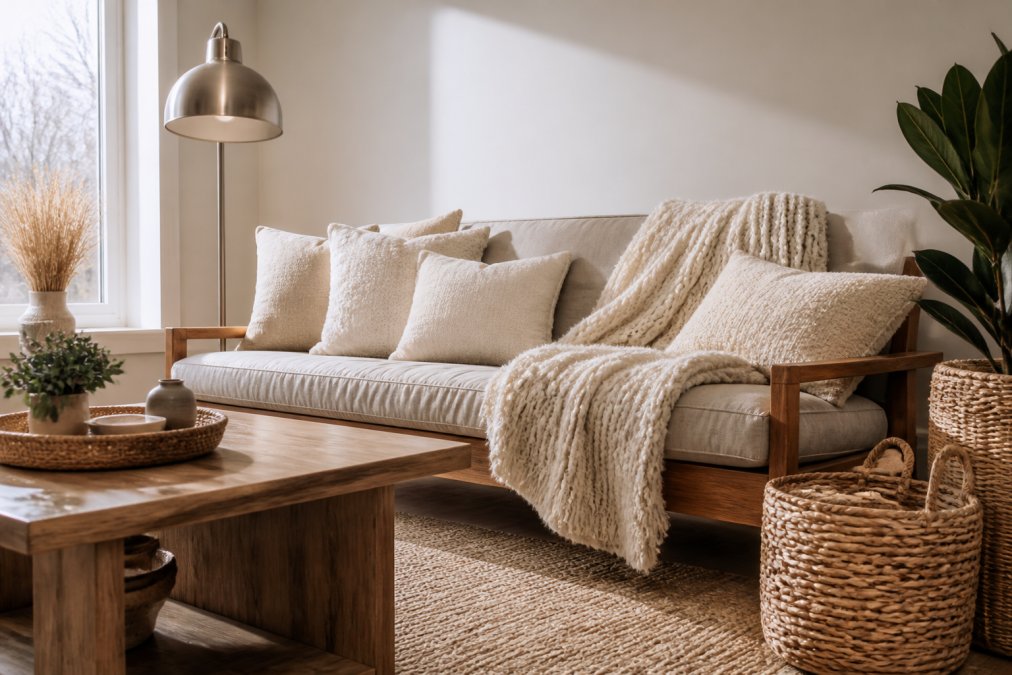
Mix soft textures (velvet, linen, wool) with hard (wood, metal, stone) for visual interest. Repeat these textures across rooms to create cohesion.
Velvet throws, curtains, and chairs across rooms create repetition. Metal frames, fixtures, and handles tie spaces together.
Mix texture scales intentionally. All soft and small-scale feels monotonous; all rough and large-scale feels chaotic. Pair large-scale geometric rugs with small-scale pillows and chunky baskets with delicate ceramics.
Home Decor Mood Board Tips for Planning Your Design
A mood board is your visual planning tool, test cohesion before committing to purchases.
Collect 20-30 images that make you feel something from Instagram, Pinterest, or design websites. Look for spaces matching your desired feeling: calm, energetic, cozy, or minimal.
Lay them out and look for patterns: repeated colors, textures, and design elements. These reveal your actual aesthetic preference, not what you think you should like.
Gather physical samples: paint chips, fabric swatches, and furniture photos. Arrange and live with them for a few days. Does your base color work with accents? Do textures work together?
Curate a Cohesive Aesthetic on a Budget
Creating a cohesive aesthetic doesn't require a complete overhaul or luxury budget. Strategic choices and patience work. If renting, have inherited furniture, or misaligned pieces, you need a different approach than starting fresh.
The Mismatched Furniture Problem
Most guides assume starting fresh. Reality: you might have a hand-me-down sofa, mismatched bed frame, and dining table. The goal isn't replacement, it's creating visual bridges that tie pieces together.
Strategy 1: Unify Through Layering, Not Replacement
Strategy 2: Create a Unifying Accent Wall or Backdrop
Strategy 3: Repeat Your Palette in Affordable, Replaceable Items
Budget-Friendly Shopping Rules
Thrift stores and secondhand markets are goldmines for unique pieces that add character without the price tag. The key is choosing pieces that fit your established palette and style. Before buying anything secondhand, ask: does this match my base color or accent colors? Does it repeat a texture or material I've already used? If the answer is no, skip it, no matter how cheap.
| Budget Strategy | How It Works | Best For |
|---|---|---|
| Layering with textiles | Add throws, pillows, rugs to unify mismatched furniture | Renters and those with inherited pieces |
| Removable wallpaper or paint | Create a cohesive backdrop that makes disparate pieces feel intentional | Rented spaces or temporary solutions |
| Thrifted accents | Find unique pieces that match your palette | Adding character affordably |
| Repetition over quantity | Buy fewer items that repeat your design elements | Creating cohesion on limited budget |
| Texture consistency | Use repeated materials to tie different-colored pieces together | Disguising color mismatches |
| DIY and upcycling | Repaint, reupholster, or rearrange existing pieces | Stretching your budget further |
Frequently Asked Questions
What is the 70/30 rule in interior design?
The 70/30 rule states that 70% of your home should feature neutral or base colors, while 30% incorporates accent colors and bolder design elements. This creates a cohesive aesthetic that feels balanced rather than chaotic. For example, keep walls, large furniture, and flooring in neutrals, then use accent colors in artwork, pillows, and decor accessories to tie the look together without overwhelming the space.
How do you create a color palette for your entire home?
Start by choosing 2-3 base colors that will dominate your home, typically neutrals like white, gray, or beige. Then select 2-3 accent colors that complement your base palette and reflect your personal style. Use these colors consistently across rooms through walls, furniture, and decor. A mood board helps visualize how colors work together before committing to purchases. This approach ensures your home feels cohesive while allowing each room its own personality.
How can I make my home look cohesive without matching everything?
Cohesion doesn't require matching furniture or decor. Instead, create unity through repeating design elements like color, texture, and style across rooms. Use a consistent material palette (wood tones, metals, fabrics) and repeat accent colors in different forms. Architectural features like trim, flooring, and lighting fixtures also tie spaces together. This approach lets you mix styles and eras while maintaining visual flow and a curated, intentional look throughout your home.
What are the best ways to create flow between rooms?
Flow between rooms happens through consistent color schemes, flooring materials, and lighting. Use transition spaces like hallways to bridge different areas with complementary colors or textures. Repeat key design elements from one room into adjacent spaces. Keep lighting temperature consistent, warm or cool throughout, so the aesthetic feels intentional. Limit the number of distinct styles, and use architectural features like doorways and trim to visually connect spaces rather than abruptly changing design direction.